ShopDreamUp AI ArtDreamUp
Deviation Actions


Suggested Deviants


Suggested Collections


You Might Like…


Featured in Groups


Description
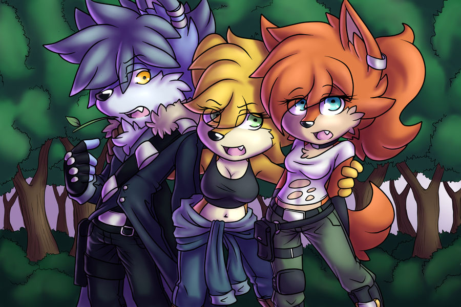
"Smile big for the camera, guys~!"
They're professionals, I promise.
Lance Volkov, Ember Grizzly, Autumn Arcane and of course the artwork © LancerWolf13
They're professionals, I promise.
Lance Volkov, Ember Grizzly, Autumn Arcane and of course the artwork © LancerWolf13
Image size
3600x2400px 5.85 MB
© 2015 - 2024 LancerWolf13
Comments25
Join the community to add your comment. Already a deviant? Log In
THE GOOD:
What I love about this picture the most would be the interaction that's going on. The obvious movement, and the expressions of the character's, brings together the whole "Smile for the camera," concept. The stance/poses of the characters, and how they're centered, brings the viewers eyes to their faces; their reactions. Even without a story, the viewer can see that the middle character came between the others, and pulled them to her, as if she was fully aware that someone was planning to take their picture- while the other two character's were oblivious. I even love how the stalk of grass that the male character was chewing on, is now falling out of his mouth, after he opened it, surprised by what the middle character is doing.
The shading is spot on, even for the foliage in the background. I'm sure there may be a hidden mistake somewhere, but I couldn't find it. I like to think the artist was going for either a mid-morning feel, or a late-in-the-day feel (considering the colors of the sky in the background, as well as where the lighting is on the characters themselves).
The style is also amazing. I've watched the artist for a long time, and can even call him a friend, and I've seen how far his artistic abilities have come. This style pops out to me in a comic book sense (or perhaps it's the coloring and shading that's doing that?). If anything, it's NOT flat, and it's overall appealing to look at.
This image is one of those images you see in your inbox, and you know from the thumbnail, that it's a masterpiece.
THE NEUTRAL
I would say that the trunk's of the tree's could probably use some more texture, but if the artist did take my advice, then he would have to give texture to the tree's themselves as well. I do really like how they are drawn already, going back to my comic book comment, but it's just my opinion.
I also think that there should have been more done with the sky in the background. The colors are slightly off to how the time of day I'm imagining would be- but then again, I'm not sure what the artist was going for here. Perhaps working a cloud, or some sort of object, into that empty space would have helped. Then again, keeping the background free of too many distracting object's and textures, helps keep the viewer's eye focused on the main point of the image.
THE BAD
I honestly don't have any bad critique for this image, aside from maybe the sky's color. The coloring, shading, and lineart are all very impressive. So no complaints.
All in all, this is a great piece! Good job Lance! <3